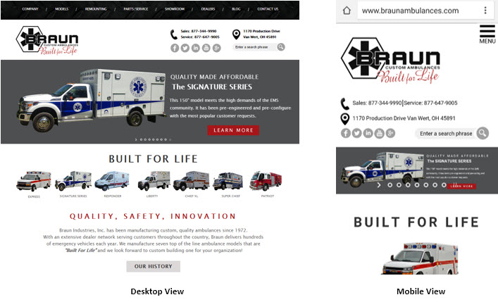
Having been in business for over 40 years, our marketing continues to change and evolve with the world around us. Today, an important part of our focus is reaching out to customers new and old leveraging the power of the Internet. We put a lot of time into managing our social media, as well as keeping our website up to date with fresh content. Part of maintaining our web presence means keeping pace with the latest technology and design principles, and we are excited to announce the launch of our new responsive website.
Responsive web design is an approach to designing a website for an optimal viewing experience on all devices. The site automatically adjusts and resizes to adapt to the type of device a visitor is browsing on, whether it be a desktop, tablet, or smartphone. Since more people now view the Internet from their mobile device than a traditional computer, this is extremely important. We are excited to offer our site visitors an enhanced experience regardless of the device they’re using.
In addition to the enhanced look and feel of the new responsive site, visitors to BraunAmbulances.com will also notice some exciting new features. The Recent Deliveries search functionality is one such feature. Visitors can now sort through Recent Deliveries by Model, Type, Chassis, Color, Delivery Date, State, and Dealership. Since this is the most visited section of the site, we are hoping this will be a welcome improvement.
The rest of the site content has been updated as well, making sure we are providing our visitors the latest information from Braun Industries. Each model overview page contains the same great details our website has always listed, with an improved layout and feed for most recently delivered units in that model. Our History page includes an updated, interactive timeline and our Locate a Dealer Map is also more user-friendly.
“We’ve been working to overhaul BraunAmbulances.com for the last several months,” says Vice President of Sales and Marketing, Chad Brown. “With around 40% of our web traffic coming from tablet or mobile devices, having a responsive site was a top priority for us. We were able to use the redesign process to reassess our site content and make improvements where we felt our visitors wanted/needed them most. We are excited to launch the new website and are looking forward to getting feedback from customers and visitors as they experience it for the first time.”
Leave a comment with your thoughts on the new site below!
